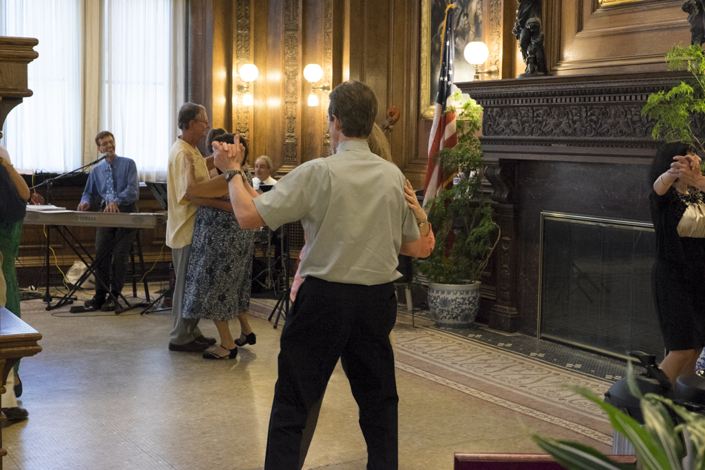
A few weeks ago, I shot a 50th wedding anniversary in Arlington, Massachusetts. It was held at the Robbins Library. I thought “Library? Ok, we’ll see”. Given that I always visit a venue a day before the shoot around the same time to get a feel for lighting, etc. At least, I try to. The library was decorated very nicely. Adding to that, the library’s interior architecture was quite striking. But I’m not here to talk about the library. I here to talk about the process of creating a finished product. Most people think that once the shutter is pressed, the photograph is “done”. In most consumers’ cases it is, but professionally it is not. The difference is based on your camera’s settings. If the camera is setup to shoot JPEG with an in-camera preset turned on, then you can say that the photo is done after the shutter release. It’s akin to shooting with a particular film type and sending it off to the developer without tweaks. In other words, processing with the film’s default interpretation of the scene. With that said, if you wanted a particular “look”, you would select a film that had the particular photochromic profile. Think “Instagram”, but more tastefully done.
Most professional photographers shoot with their cameras set to create RAW files instead of JPEG. A RAW file is an unaltered image file (or with some slight alterations, depending on the camera brand). The image is as the camera “sees it”. Each camera brand/model has a proprietary file format. Adobe tried to make RAW files standard by creating the DNG (Digital NeGative) format. Only a few cameras manufacturers have adopted this including Leica. The reason why it’s not widely adopted is that RAW files also contain other information that pertains to the camera itself: the shooting mode, the lens used, flash, etc. For DNG to be widely acceptable, either all manufacturers create cameras with the same features or the DNG format has to encompass the features of all the camera brands/models. In any case, processing an image from the RAW file gives the most flexibility as far as edits that can be made to it. But I digress…again.
As I processed these anniversary photos, I thought about what film type would fit each scene. I paused for a moment and thought about the photographs by others like Kevin Mullins (example photo), David Oliver (example photo) and Jeff Ascough (example photo), to name a few, particularly their black and white offerings. Their processing creates images with high contrast that makes the images look more “intimate” in my opinion so I set out to duplicate the process. Then, I paused again. I wondered, are these images good/interesting because of the processing or because of the subject matter or context of the image? Or perhaps both?
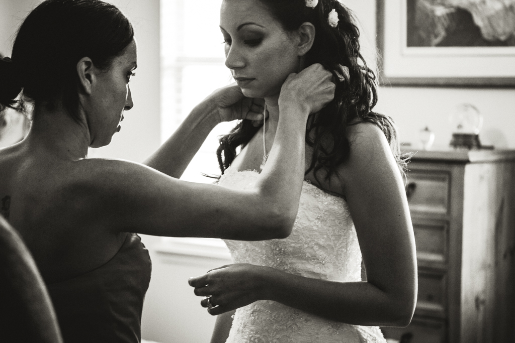
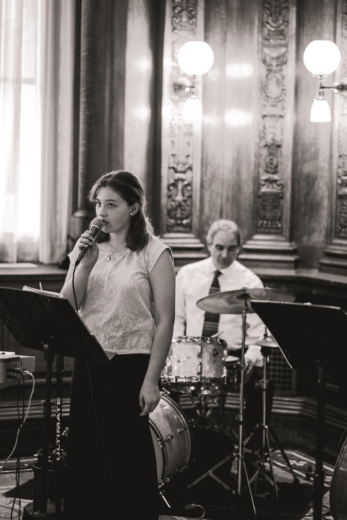
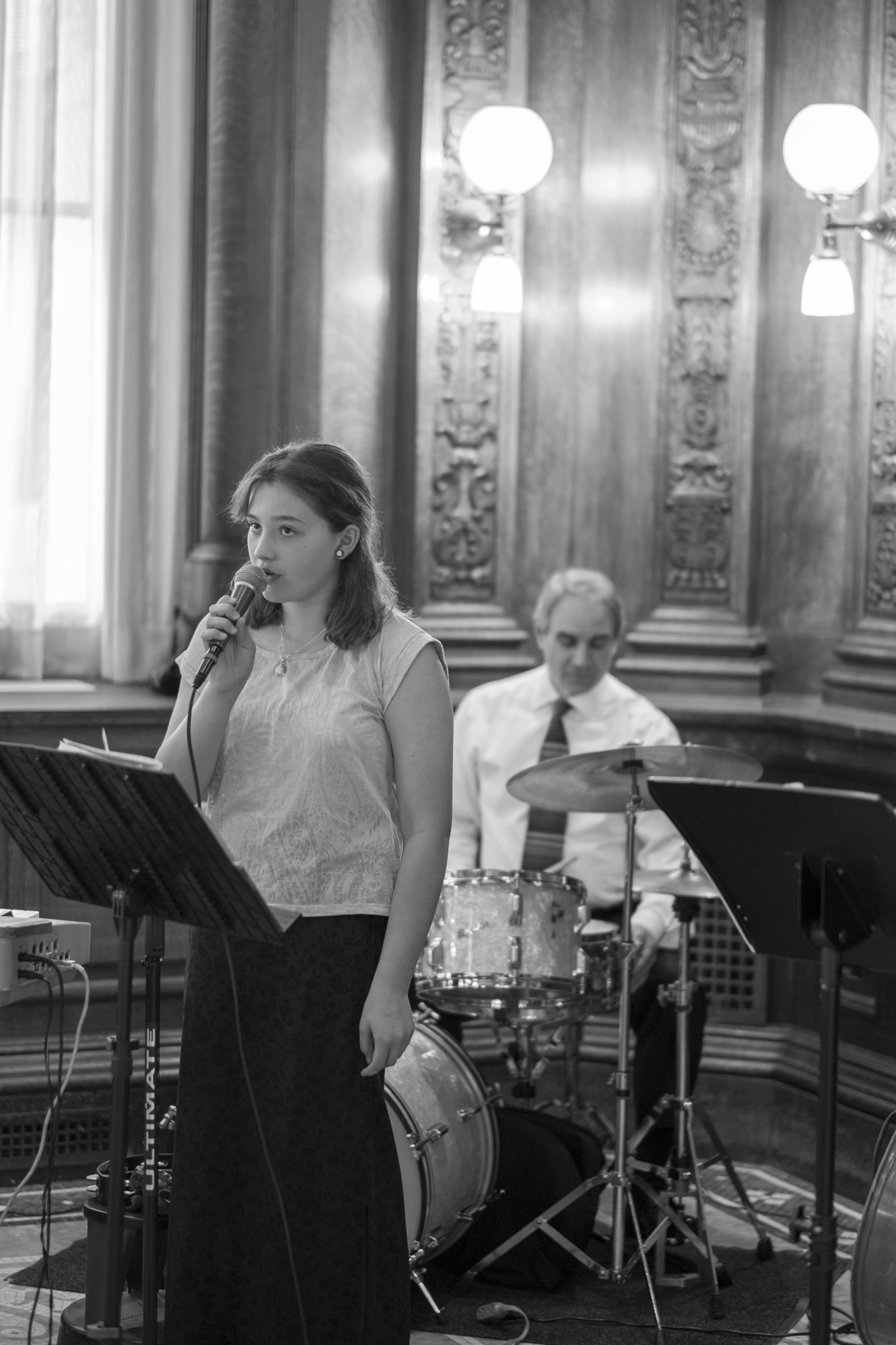
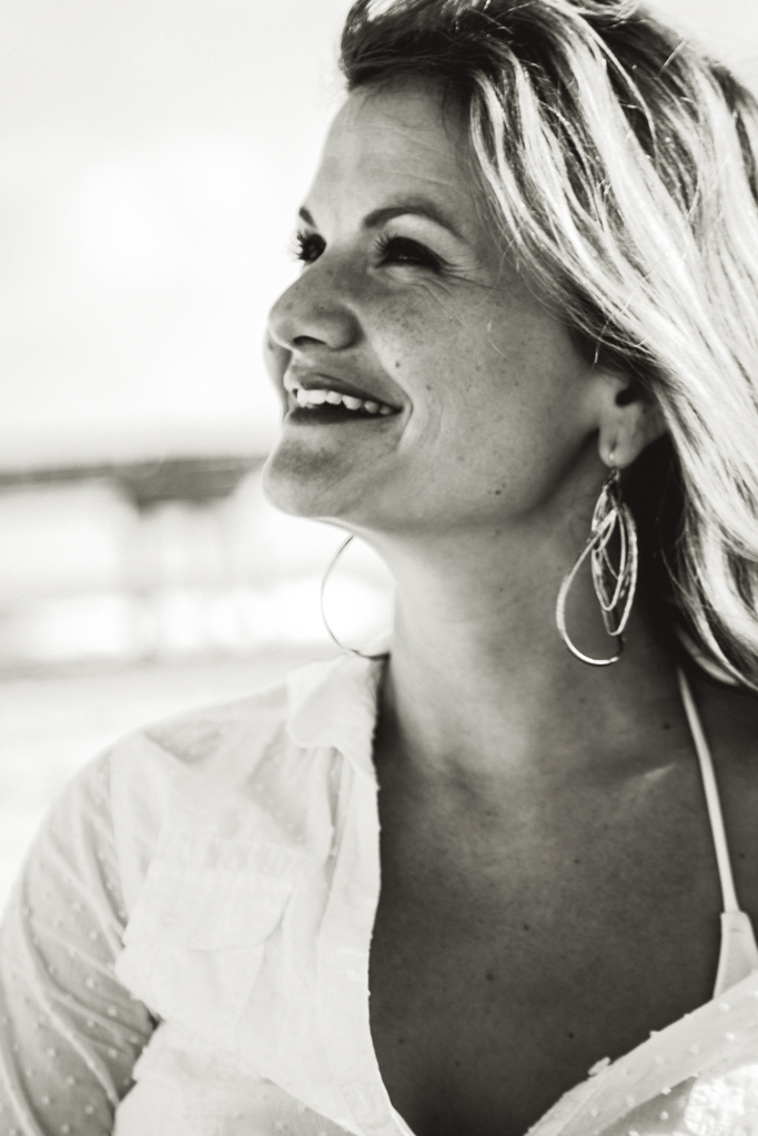
Before I could answer those questions, I first set out to create a preset in Adobe Lightroom that I can apply to my photos. A preset is a set of edits on a photo that are saved so that you can apply them to other photos. Before I demonstrate, I should mention that I tend to visualize what the final processed image will look like at the time I take the photo. This is how I target which photo stays in color and which photos are converted to black and white. I picked a photo from this set (my favorite one) and edited it until I got, what I thought at the time, was a good result. Below is the original shot and the first pass edited shot (taken with Fujifilm X-T1 camera, XF 56mm f1.2 R lens, @ f/1.2, 1/125, ISO 640):
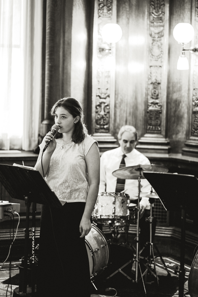
I then struck up a conversation with Matt Gore and after a bit of analysis on Mr. Mullins’ photos in comparison to my preset, Matt made a few suggestions, which I applied to the preset and this is the final result:
Prior to this preset, I processed all my black and white photos to be as dark as possible without losing detail. So I would have processed the photo like this:
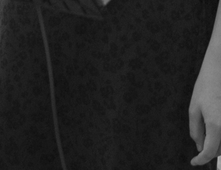
A 100% of the photo near the girl’s left hand reveals the detail on her skirt. The new preset completely wipes it out leaving a pure black skirt:
This is still nice, but it doesn’t have the “intensity” of the new preset. Now to answer the question: “Is it the preset, the content, or both?”
I applied the preset to a blasé photo taken in a different part of the venue with different lighting. Here’s the result:

In my opinion, it’s a bit interesting as far as its tonality, but nothing else. I then tried it on other photos: sunny, overcast, flash, etc., and I noticed a few things:
- The preset works better in cases where there is already plenty of contrast.
- It doesn’t work on high-key scenes like on a sunny beach unless shadows are cast as in the image below, in which case, it renders an “organic look” to the photo. Quite natural. (one of my favorite photos of that shoot)
- It won’t work miracles on photos that are not interesting to begin with.
The photographic process requires a lot of attention to lighting, composition, technique and the subject matter (some say the “decisive moment” as coined by Henri Cartier-Bresson) at the time of capture. But, in addition to that, one must pay attention to the presentation. Film and film processing (dodging, burning, cropping, etc) were (and still is, to some extent) the vehicles to make this happen. Knowing or being cognizant of that process allows you to apply those techniques in your digital workflow. It’s understood that one must develop a style, but using the same “tool” for everything is not conducive. That is to say, I won’t use this preset for EVERYTHING, but for photos that have the disposition for this kind of presentation.
So work hard at capture and work hard at presentation.
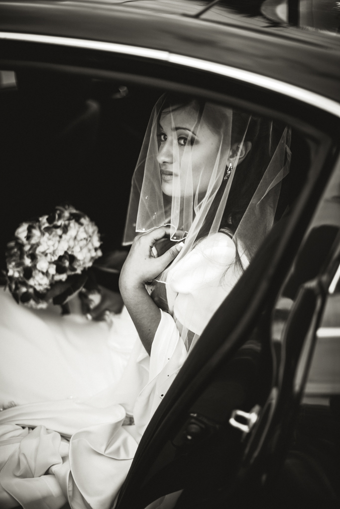
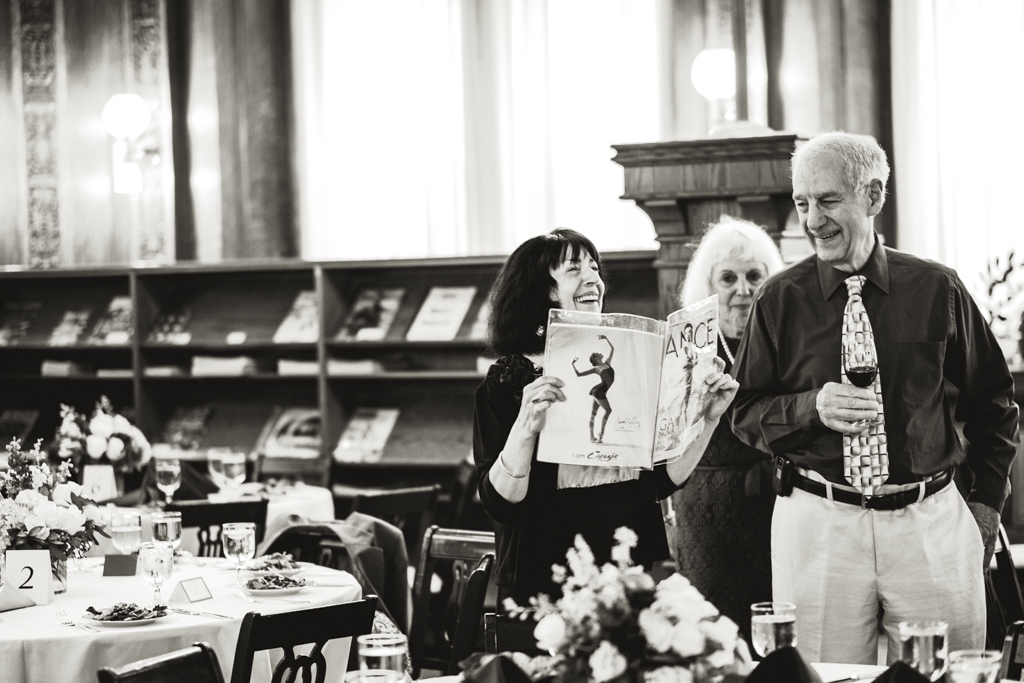
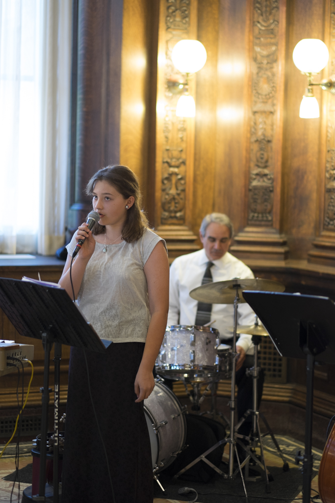
Here are more photos from past shoots with the preset applied (where applicable):